How to learn EDA using Cinderella?-Exploratory Data Analysis
Getting to the point: (In simple English, the way I wish I was taught) + Cinderella reference.
What is EDA?
Exploratory Data Analysis (EDA) — Remember, how good you are at this will make a huge difference professionally.
Exploratory Data Analysis is a method used to analyze datasets, we look for basic characteristics (refer to example) and produce an overall review by using visualization (literally what it means, visually see them using graphs, charts…).
Why EDA?
“If you torture the data long enough, it will confess.” — Ronald H. Coase
This quote is precisely why we perform EDA. When you pick a dataset, you know nothing about it…
Is it clear? free of errors? Hopefully not, you won’t have a job if it is free of errors…*Insert laughing emoji*. EDA will help you understand your data better, allow you to find different patterns (you are a detective at this point), and we can say “Hey you, out li(a)er” (I don’t know why I do this).
Basically, EDA is the Fairy helping Cinderella (Dataset) get to the ball (your client’s profits) without wearing the ugly ragged dress (errors, yuck).
(Skip the next part to avoid Cinderella comparisons, go to STEPS TO PERFORM, adult.)
Let’s set goals. What are we trying to obtain out of this interesting process?
- The fairy takes a quick look at Cinderella to understand the problems: A quick scan of the data- how is it allocated?
- Fairy fixes the missing attributes- Handle the missing values (EVERY DATASET WILL HAVE THIS).
- Fairy notices the outdated outfit and fixes it- Handle the outliers.
- Fairy removes any non-branded accessories- Remove the duplicates.
- The fairy gives a makeover to Cinderella- Encode the categorical variables.
- The Glass slipper (Ironically, brings the whole outfit to a suitable look)- Normalize and Scale the data.
Steps to perform EDA. (No Cinderella comparisons here)
Step 1: -Import all necessary libraries. (Note: Some of the libraries here are used for Predictive modeling, you do not have to install everything)
The two most important ones to know: NumPy (Mathematical) and Pandas (Data Manipulation)
Step 2: Load the data set and display the rows, collect their information, size, shape…
- head()- Used to display the first 5 rows.
- tail()- Used to display the last 5 rows.
- shape()- Used to get the number of rows and columns.
Step 3 is otherwise called the Measures of Central Tendency — One of the most important concepts you’ll come across in Data Science/Analytics.
Step 3: Let’s get into Statistical Data. What is that? It is the Mean, Median, Mode…(Refer to the image)
I have used the describe() function and transposed it…remember 11th-grade matrices? Transpose?Yes, that concept…if you do not remember it, it’s okay… look at the image below
Here A is the actual Matrix, A’ is the Transpose Matrix.
Step 4: Data Cleaning
- Now, we shall see if we have any null values, by using isnull() function and getting the sum of that by using the sum() function.
- We are also going to find if we have any duplicate values by using the function duplicated(). To drop the duplicates, use df.drop_duplicates(inplace= True)
- If we have null entries (here, I do not have any null values, so I am not using it- But in the real world, you can definitely expect them) use this (given below) function to drop the null values, if they exist.
.dropna()(axis = 0, inplace = True)
Let’s say you have to fill the missing value, use function .fillna()
For example: df[“Salary”].fillna(value=df[“Salary”].mean(),inplace=True)
Step 5: Heart of the whole process- Data Visualization.
Data visualization is literally visualizing the data given to you.
As far as I know, there are no set steps to follow for data visualization… there are way too many ways to visualize and interpret (this is where you use your analytical skills). I am going to explain a few ways to visualize.
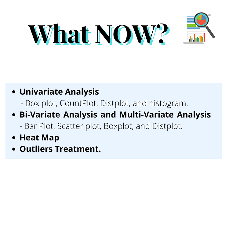
Univariate Analysis.
To describe in the simplest form- Univariate Analysis looks at just one variable. Just one factor is considered and examined closely.
What kinds of visualization are used for this analysis?
- Boxplot- The boxplot is used to display the maximum, minimum, mean, median, range, and quantiles.
- Code:
sns.boxplot(data=eda_df, x='Type', y='Sales',hue='Claimed')

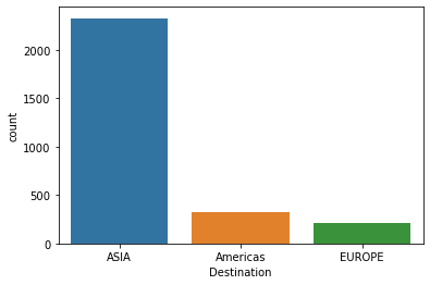
- Countplot- Countplot is used to ‘count’ or observe the commonness or frequency in the form of a bar chart.
- Code:
sns.countplot(data=eda_df, x= 'Destination')
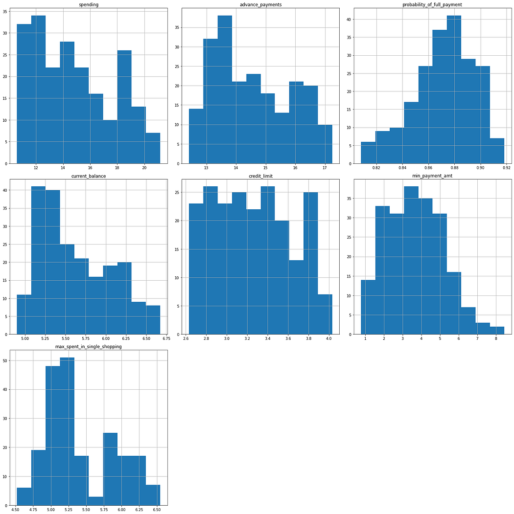
- Histogram- To be precise- I like to think of Histogram as “ I call it like I see it” it tells you exactly what’s going on, what the distribution looks like but placing them in rectangular buckets. (refer image)
- Code:
#Let us create a histogram to check the distribution type.
#copy the original dataframe
df2=eda_df.copy()
fig=plt.figure(figsize= (20,20))
ax=fig.gca()
df2.hist(ax=ax)
plt.tight_layout()
plt.show()
Bi-Variate Analysis and Multi-Variate Analysis.
Bi-Variate Analysis as the name suggests deals with two types of variables. Here, instead of focusing on just one variable, we focus on two and see what we can interpret from it. (We are trying to understand the relationship between two variables here)
Multi-Variate Analysis is looking at multiple factors, variables to conclude a solution. (We are trying to understand relationships between multiple variables). Remember, as tempting it can be to conduct this analysis in 3D, it is way too confusing to interpret. Therefore, go with Scatter Plot.
Let us ask the same question we asked in Univariate Analysis- What kinds of visualization are used for this analysis?
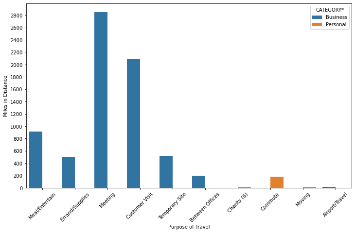
- Barplot- Barplot is the easiest visualization plot there is, almost similar to histogram “But histogram is NOT barplot”. Barplots are used to represent categorical variables.
Let me put it this way, HISTOGRAM = NUMERICAL variables, whereas, BARPLOT= CATEGORICAL variables.
plt.figure(figsize=(12,7)
sns.barplot(x='PURPOSE*',y='MILES*',estimator=np.sum,data=uber,ci=None,hue='CATEGORY*')
plt.xticks(rotation=45)
plt.yticks(np.arange(0,3000,200))
plt.ylabel('Miles in Distance')
plt.xlabel('Purpose of Travel')
plt.show()
print('From the Uber Dataset, Cabs are used for Business meetings compartively more than Personal use'))
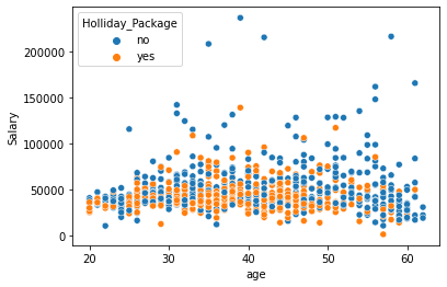
2. Scatterplot- Scatter Plots are much easier to look at than 3D visualization, it is easier to interpret the data. In the image given below, we can clearly see how many have opted for Holiday Package by looking at the relationship between their age and salary
sns.scatterplot(data=df,x='age',y='Salary',hue='Holliday_Package')
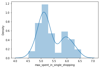
Distplot-Distplot depicts the distribution of continuous data variables. The Distplot is a visualization for the data by the combination of a histogram and a line.
sns.distplot(df['max_spent_in_single_shopping'])
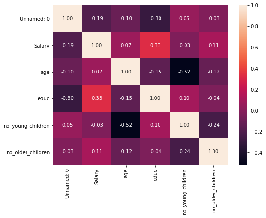
Heat Map:
One of my favorites- the colored map. It contains values that represent different shades for the same color for plotting each value.
Darker Shade= Higher values, Lighter= Lesser Value.
You can use any color of your choice.
WHY HEATMAP? — Just another way to understand the relationship between two or more variables. By looking at the image below, pick two categories and look at them from Y-axis to X-axis, and then again the same from X-axis to Y-axis.
We are looking for Correlation here:
df_cor=df.corr(
plt.figure(figsize=(8,6))
sns.heatmap(df_cor,annot=True,fmt='.2f'))
One of the most IMPORTANT factors: OUTLIERS TREATMENT.
From the analysis done above, most of the time you will come across outliers. Treating these outliers is important, and let’s see how to do this.
Note: We can either drop the outlier values or replace the outlier values using IQR(Interquartile Range Method). Once you have used the code below to remove the outliers, the boxplot can be used again to check for any more outliers.
def remove_outlier(col)
    sorted(col)
    Q1, Q3= np.percentile(col,[25,75])
    IQR= Q3-Q1
    lower_range =  Q1 - (1.5* IQR)
    upper_range =  Q3 + (1.5* IQR)
    return lower_range,upper_range:lratio,uratio=remove_outlier(df['Apps'])
df['Apps']= np.where(df['Apps']>uratio,uratio,df['Apps'])
df['Apps']= np.where(df['Apps']<lratio,lratio,df['Apps'])
lraxis,uraxis=remove_outlier(df['Accept'])
df['Accept']= np.where(df['Accept']>uraxis,uraxis,df['Accept'])
df['Accept']= np.where(df['Accept']<lraxis,lraxis,df['Accept'])
lraspect,uraspect= remove_outlier(df['Enroll'])
df['Enroll']=np.where(df['Enroll']>uraspect,uraspect,df['Enroll'])
df['Enroll']=np.where(df['Enroll']<lraspect,lraspect,df['Enroll'])
lrscaled_var,urscaled_var= remove_outlier(df['Top10perc'])
df['Top10perc']=np.where(df['Top10perc']>urscaled_var,urscaled_var,df['Top10perc'])
df['Top10perc']=np.where(df['Top10perc']<lrscaled_var,lrscaled_var,df['Top10perc'])
lradius_gyration, uradius_gyration = remove_outlier(df['F.Undergrad'])
df['F.Undergrad'] = np.where(df['F.Undergrad']>uradius_gyration,uradius_gyration,df['F.Undergrad'])
df['F.Undergrad'] = np.where(df['F.Undergrad']<lradius_gyration,lradius_gyration,df['F.Undergrad'])
lSkew, uSkew= remove_outlier(df['P.Undergrad'])
df['P.Undergrad'] = np.where(df['P.Undergrad']>uSkew,uSkew,df['P.Undergrad'])
df['P.Undergrad'] = np.where(df['P.Undergrad']<lSkew,lSkew,df['P.Undergrad'])
Exploratory Data Analysis is one of the most beautiful and easiest ways to represent and interpret your data. Data Visualization is easy with EDA, therefore, making it easier to comprehend.
Until next time, fairy.